Welcome to Box Art Brawl, the contest which pits regional box art variants from across the globe against each other in a deadly duel to the death. Well, not really — you just vote for your favourite, like. It’s a bit of fun, see?
Last time we witnessed Donkey Kong Country 2: Diddy’s Kong Quest give itself a sound thrashing as the North American / European variant beat the Japanese version with approximately two-thirds of the vote to one. Congratulations to Donkey Kong Country 2, commiserations to Super Donkey Kong 2. Incidentally, earlier this week Nintendo UK sought to clear up a common error around that particular game’s subtitle in the West — something that a few brawl enthusiasts (and even a Nintendo Life staffer or two) didn’t realise until recently.
Today we’re looking at a game which celebrated its fifteenth anniversary earlier this year. Yes, Advance Wars: Dual Strike brought Intelligent Systems’ ‘Wars’ series to Nintendo DS and while the European and North American covers were identical, the Japanese one is totally different and even has a completely different title.
Enough talk — let’s advance.
North America and Europe
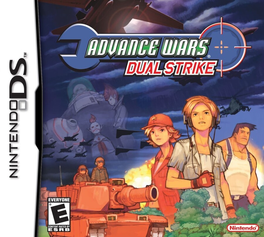
We recall feeling indifferent to this cover when it released in 2005. Perhaps it was how the purple-y-blue wrench got lost against the purple-y blue sky, or how the figures on the left were fading away and leaving a big gap on the cover. Still, the more we re-examine this one, the more we like it. The subtle, painterly palette might not pop like some covers, but there’s lots dig into here, even if some of it gets a little lost.
It’s got the obligatory DS-based subtitle, so extra points for that.
Japan
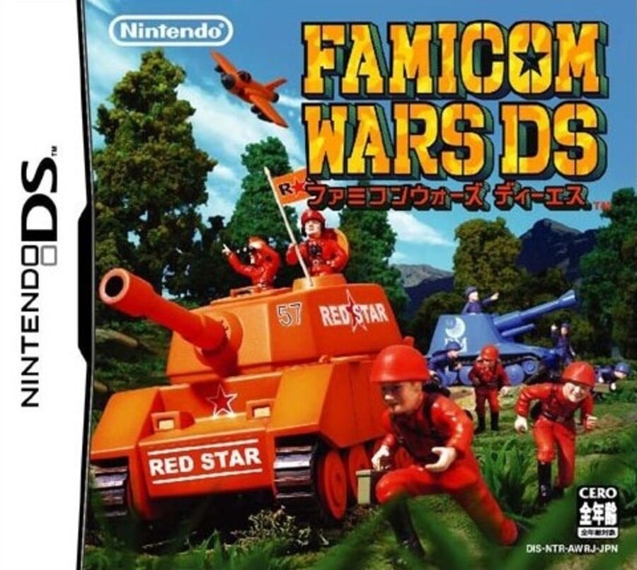
If you thought that ‘Advance Wars’ title in the West was a misnomer considering the game was on the Game Boy Advance’s successor, you’re about to get very upset. Yes, in Japan the DS game had a title that carried over from the very first game in the series on Famicom, a game we’d never see on NES in the West.
Nintendo broke out the toys for this colourful cover and it shows a more lighthearted approach to warfare than its western brethren. The big brash logo fits the bill nicely, and the only thing that could make it better would be if the barrel on the tank broke the border a little. We like it.
So, you’ve seen the two options, but which is best? Pick your favourite and hit ‘Vote’ to let us know:
And that’s another brawl in the can. Take it easy wherever you are and we’ll see you next time for another bout.


